A Case for Gray
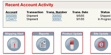
While designing a sytem for alerts on a customer service site I’m working on, there’s been a debate about the best way to notify users of new content. The basic format is for a series of icons to set at the base of the landing page, one for each major category of alerts – site updates, miscellaneous news, shipping alerts, etc.

The challenge is to let the user know when the content has been updated, while keeping the non-updated content available but ‘hidden’. There were two major ways to use these icons to convey the updated/not updates scenario.
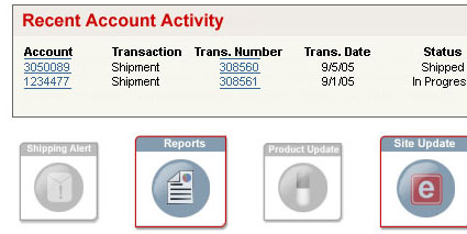
- Use colorful icons to highlight updated content, and use ‘grayed out’ icons for content that hasn’t been updated.
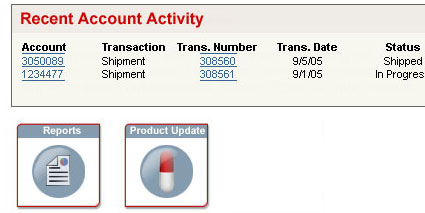
- user icons to signify new content and remove icons that haven’t been updated
The first scenario was my preference because it allows the icons to always remain. Despite best effort to avoid it, we know that these icons will be come navigation, so I wanted to maintain a method for the user to get back to the content at a later time. If we removed the icons of content that hasn’t been updated, the user loses that form of de facto navigation.

So, I proposed leaving the icons there, but graying them out to show that they aren’t as relevent to the user at that time. By having the items with recent content highlighted, the user would know that there was real content there to take a look at, while they could choose to ignore the more subtle icons.

A concern with this method was the general aesthetic of Windows and Mac users – that a grayed out icon represents a non-functional button. I realized this, but still felt that as the user played with the icons the first time, they would come to realize the functionality of the buttons – although I couldn’t say how long it would take to come to this level of understanding.
The second problem came from the definition of ‘recent content’. In my mind, the functionality should highlight any topic that had new content within the last two weeks – UNTIL the user clicked upon that icon and viewed the listing of alerts for that topic. At that point, the icon would be grayed out until a new piece of content was added. This way, the only time the user would see the colorful “LOOK AT ME!” icons would be recent content that they had not yet seen. We weren’t going to go so granular as to test if they had viewed all the recent content – simply going to the page with the listings would be sufficient in our eyes.
However, others thought that it might be overkill to tie the viewing of the alerts to a user profile; instead, it was decided that simply having a time span – 2 weeks – would be the signal for the Updated/Not Updated flag on the icons. I have my concerns with this, as I feel that it will lead to a user repeatedly clicking on the icon, only to find the same content – and eventually, they will stop clicking more than 1 or 2 times a week and could miss potentially important information on a topic that has been updated 3 or 4 times in a 2-week period.
In the end, they also decided against the grayed out versions as a whole, because of their concerns over the ‘not available’ aspect of grayed icons. Instead, we’re going to leave the same icons regardless of timing, viewed status, or new content. I’ve argued against this solution, but in the end, the timing and company needs will probably lead this to the simpler solution. It’s not a bad solution, perhaps, but usability-wise, I think it’s far from the best one.
I tried to find studies online that supported my theory regarding the grayed out and timing of the icons, but wasn’t successful in finding any relevent information either way. Still, I have to think that two things would be essential in delivering this type of data to the user:
- Letting the user know when information has been updated
- Ensuring that the user can get back to the information after it has been seen
To that end, it seems to me that the no-brainer is to make sure that the icons stay around in both ‘new’ and ‘old’ content states, to allow the user to get back to content that they may have viewed but want to see again. The more complex usability decision is how to deliver that content, differentiating between the two states. The grayed out and colorful icons provide a good way to convey the idea of ‘new’ content vs. seen content, regardless of the risks for confusion with unavailable operations. Using a user-based method of determining ‘viewed’ makes more sense than a time-based on, although the application is necessarily more complex. Still, I think the extra work would be worth it.
More Fun Stuff »
- Roger Johansson at 456bereastreet.com has done it again. Check out his CSS 2.1 Selectors Part II (combinators, combined selectors, grouping, and attribute selectors) and Part III (pseudo-elements and pseudo-classes)