Fairweather Zealot
All the Rants that Beer and Birding Can Buy
Home
2021 Big Year
2016 Year List
Design
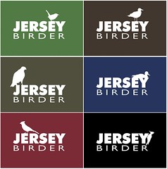
Jersey Birder Samples
Lorem Interesting
Lazy Night
A look back…
First Information Anarchy T-shirt Up.
Why You Don’t Skimp on QA
Adobe Visio?
Merry Christmas
Syncing Shapes in Visio
November Usability/Accessibility Article Roundup
Posts navigation
1
2
3
4
5
…
9